
Block Showcase
Text + Image
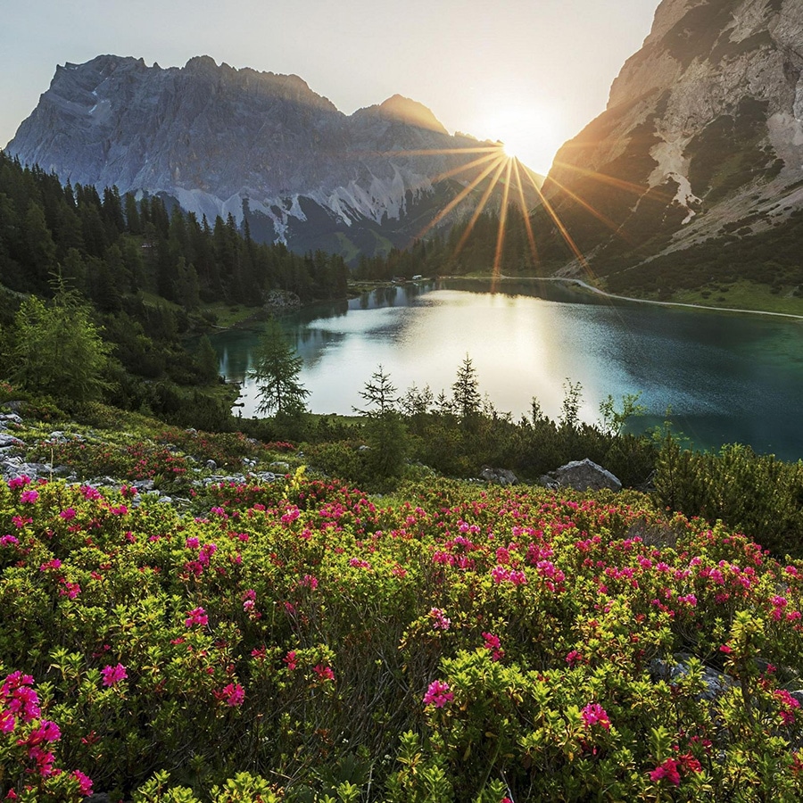
In its natural, unaltered state
This is the default state of the Text + Image block, which is very versatile. Interdum et malesuada fames ac ante ipsum primis in faucibus. Integer eget urna consequat nisl pharetra cursus quis a ligula. Sed tellus tellus, faucibus sed consectetur eu, convallis non nisl. Nulla dapibus eget mi nec laoreet.
Lots Of Options
It’s super configurable!
The Text + Image block can be configured to have the image either on the right or left, and then there are four choices for the display of the image:
- Landscape (above)
- Square (this one!)
- Circle (below)
- Fill Column
It can also have up to three buttons!
Column Proportions
Configurable for half/half, two-thirds/one-third and one-third/two-thirds layouts
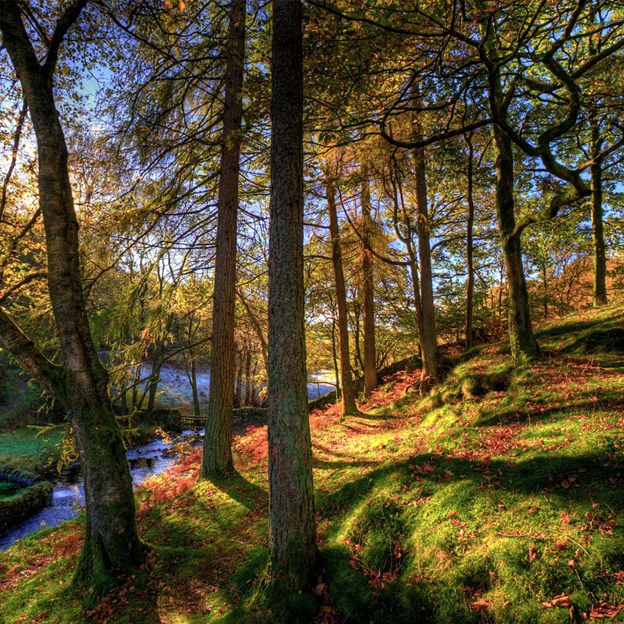
This block displays the photo as a circle, and unlike the Half/Half configurations in the blocks above, this uses the Two-Thirds/One-Third configuration, so the column on the left will be Two-Thirds, and the column on the right will be One-Third. If you were to change the orientation of the image to be on the left, it would be the larger column. Does that makes sense?
The Image Can Fill The Column It Lives In
Like in this content block, for example
Here, the image style is set to Fill Column. The height of the block is determined entirely by the amount of copy in it, and the image will be cropped into the height and width available. That is to say, the more copy we put in this area, the taller the image will be.
Phasellus consectetur enim vitae pretium auctor. Duis at lectus felis. Vestibulum ante ipsum primis in faucibus orci luctus et ultrices posuere cubilia curae; Nam efficitur, lectus sed feugiat egestas, nisi lorem accumsan erat, non porta eros diam eget mi. Integer lacinia pharetra tellus nec posuere. Maecenas tincidunt tempor sem vitae vestibulum.
Videos Work Too
Even more versatility!
Just change the style of the block from Image to Video and paste a YouTube or Venmo link in. As with an Image, it has various display options including Widescreen (16:9) which is the default, Fullscreen (4:3) and Square.
But Wait, There’s More!
You can also use a carousel of images
The images can again be in Landscape, Square or Fill Column format (not Circle), and you can optionally display arrows and add captions to the images. Aliquam ullamcorper aliquam ipsum a euismod. Sed elementum est id hendrerit auctor. Nam placerat vulputate justo nec ultrices.